
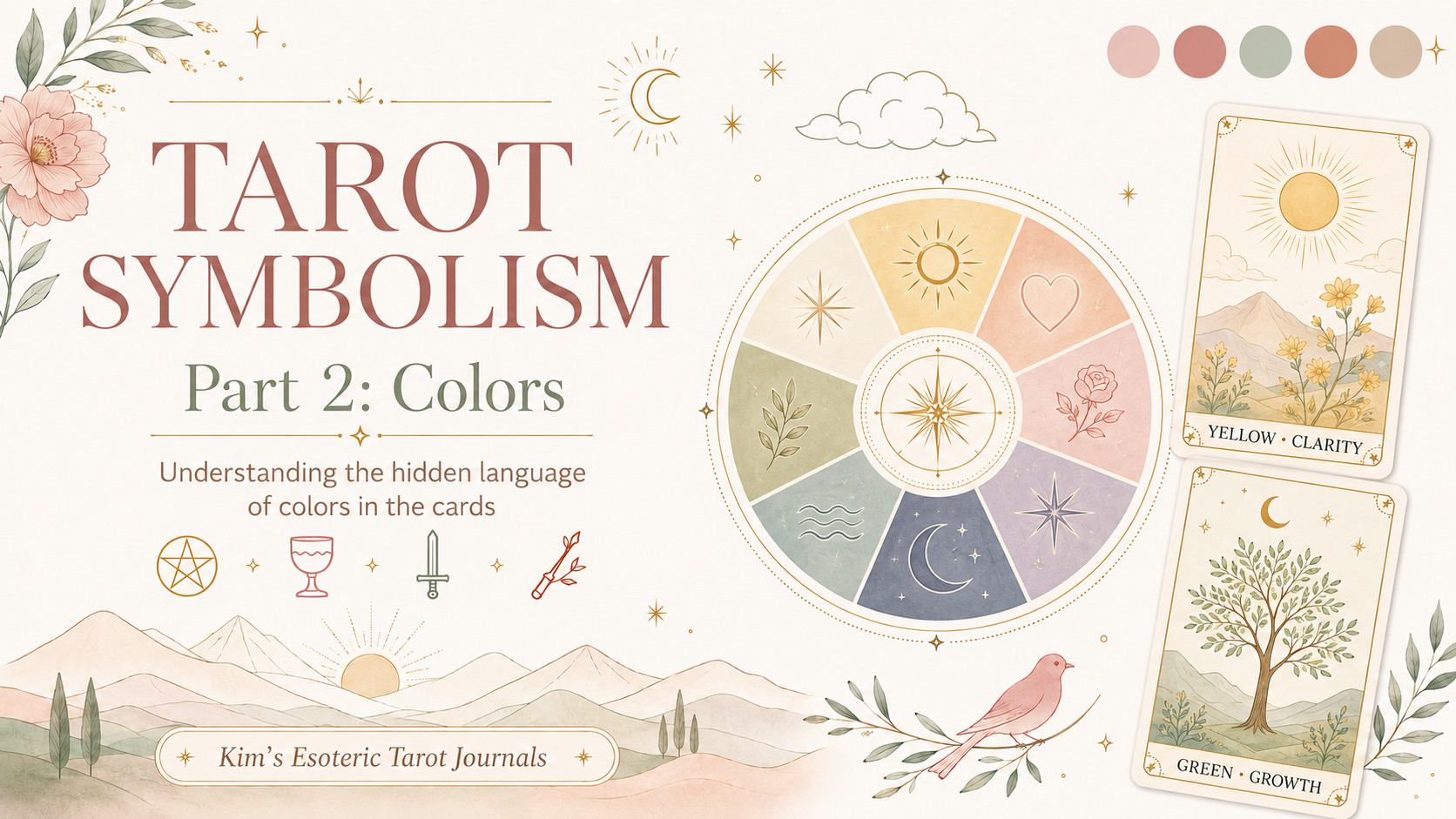
Tarot Symbolism 102: Reading Color in the Cards
Tarot Symbolism 102: Reading Color in the Cards
Last time, we looked at numerology and how the number on a card tells you where a situation sits in its natural cycle. Today we are moving into the next layer of tarot symbolism: color. Color is one of the first things your eye lands on when you pull a card, and it is doing a lot of quiet work before you even start thinking about the card’s traditional meaning.
You have probably already felt this without realizing it. A card dominated by dark grays and blacks reads differently than one filled with gold and white, even before your brain processes the image. The artists behind the Rider-Waite deck did not choose colors at random. Every shade in those illustrations carries meaning, and once you know what to look for, color becomes one of the fastest ways to get an immediate emotional read on a card before you consult any other reference.
What Color Adds to a Reading
Traditional card meanings tell you what a card is about. Color tells you how it feels. A card with warm reds and oranges has a different energy than the same type of card rendered in cool blues and grays, even if the structural meaning is the same. Color speaks directly to the emotional temperature of a situation.
When you are reading a spread, notice whether the cards are dominated by warm tones, cool tones, or a mix. A reading full of warm reds and yellows often signals action, urgency, or passion. A reading heavy in blues and purples tends to point toward inner work, spirituality, or a situation that calls for calm reflection. A mix of dark and light throughout the spread can indicate tension between what is known and what remains unresolved.
Color Chart
Here is a quick reference for the colors most commonly found in Rider-Waite tarot cards and what each one generally brings to a reading.
| Color | Core Energy | General Meaning |
| Red | Passion | Action, desire, courage, and raw energy |
| Orange | Drive | Ambition, creativity, and enthusiasm |
| Yellow | Clarity | Optimism, intellect, and mental energy |
| Green | Growth | Abundance, healing, and connection to nature |
| Blue | Truth | Calm, communication, intuition, and spiritual awareness |
| Purple / Violet | Wisdom | Mysticism, higher knowledge, and spiritual depth |
| White | Purity | Clarity, innocence, spiritual protection, and new beginnings |
| Black | Mystery | The unknown, transition, endings, and the subconscious |
| Gray | Neutrality | Uncertainty, ambiguity, and situations not yet resolved |
| Brown | Grounding | Practicality, stability, and connection to the earth |
| Gold | Radiance | Divine energy, success, spiritual illumination, and high achievement |
Quick Examples
The Fool is surrounded by white and yellow. The white sun behind him signals purity and divine protection. The yellow background reinforces optimism and the open, unguarded energy of someone stepping into something entirely new. Even before you think about the cliff or the little dog, the color palette alone tells you this is a card of bright, unfiltered possibility.
The High Priestess is almost entirely blue. Her robes, the curtain behind her, and the water at her feet all carry that cool, still, inward quality. Blue here is not melancholy. It is the color of deep knowing, intuition held quietly rather than spoken aloud. The card feels calm because it is meant to. That stillness is the point.
Compare that to The Tower. The dark sky, the gray stone, and the burst of orange and red flames tell the story before you read a single word. The warm tones of fire against the cold structure signal sudden disruption. Nothing about that color palette is comfortable, and it is not supposed to be.
The Star brings a shift back to blues and soft neutrals, with a single figure pouring water under a clear sky full of stars. After the chaos of The Tower, the color palette alone signals relief and renewal. Even without knowing anything else about the card, it reads as calmer and more hopeful than what came before it.
How to Use This When You Read
When a card comes up in a spread, try asking a few quick questions about its color:
• What is the dominant color on this card?
• Does the color feel warm, cool, or neutral?
• Does the color match or contrast with the card’s traditional meaning?
• Is this color repeated anywhere else in the spread?
That last question is worth sitting with. When the same color appears across multiple cards in a spread, it is rarely a coincidence. A spread with blue showing up in three or four cards is pointing toward a theme of intuition, communication, or spiritual awareness, even before you read the individual cards in detail. Color repetition strengthens a message the same way number repetition does.
Color is meant to add depth to a reading, not replace the card’s traditional meaning. Keep the question, the position in the spread, and your intuition in the mix.
Coming Up Next
Color is just one more layer of the symbolic language running through every tarot card. In the next blog, we will look at direction and body language: what a figure’s gaze, posture, and position on the card reveal about the energy at play. From there, the series continues through clouds and weather, animals, plants and flowers, the four elements, celestial symbols, clothing, objects, landscapes and buildings, and repeated symbols.
Have you started noticing color in your readings? If so, what are your thoughts?
Tarot readings are intended for adults aged 18 and older and are provided for entertainment and personal reflection. Tarot should not replace professional medical, legal, mental health, or financial advice.
© 2026 Kim’s Esoteric Tarot Journals. All rights reserved.
 Kim's Esoteric Tarot Journals
